Spend
Dual-app fintech ecosystem supporting users on their financial journey

Objective
Spend is a dual-app fintech ecosystem designed to support financial independence through automation. Whether users are focused on paying off debt with SpendDebt or investing in their future with SpendAway, each app turns everyday card swipes into intentional progress through user-determined micropayments that are collected and applied to their chosen destination at the end of each month.
The goal was to create a trustworthy experience that makes financial automation feel simple, transparent, and emotionally manageable, reducing financial anxiety.
Client
Spend
Year
2023 / 2025
Service
UI/UX APP DESIGN
SPENDEBT SYSTEM

SPENDAWAY SYSTEM

Execution
01 / PRODUCT DEFINITION
In the early stages, the founders discussed how they envisioned the app functioning, but they needed help simplifying the idea and better understanding the user. I presented research and empathy-driven considerations to define how micropayments should function, how users would understand their impact, and what information was essential to build trust, as finances—especially debt—can be very overwhelming. To accomplish this, I revamped the onboarding flows, dashboard layouts, key features, and visual data points that define the app ecosystem.
02 / SYSTEM ARCHITECTURE
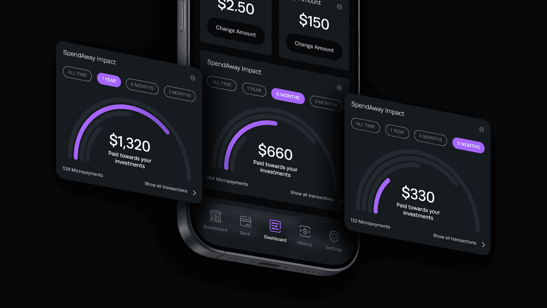
SpendDebt and SpendAway are built on a shared visual and component system that allows for brand consistency for users who use both apps, while also supporting faster development and long-term scalability. The structure supports automation, transaction tracking, and account linking without requiring core components to be redesigned for each product. The visual system centers on large balance indicators, simplified data charts, and calming dark tones contrasted by color for emphasis.
03 / INTERFACE & VISUAL LANGUAGE
While the apps share the same system, they are intentionally differentiated through color and tone. SpendDebt uses green to signal progress and stability, reinforcing the idea of reducing what you owe. SpendAway uses purple to represent growth and expansion, supporting the concept of building what you own. The overall UI is dark, minimal, and restrained, with color used sparingly for emphasis. This approach reduces visual noise and helps financial data feel controlled rather than overwhelming.
04 / USER EXPERIENCE & EMOTIONAL CLARITY
Financial dashboards often create anxiety through cluttered metrics and competing focal points. I designed the experience to prioritize clarity focusing on single, meaningful progress indicators instead of dense charts. Transaction visibility is transparent and easy to scan, reinforcing the sense that automation is working quietly in the background. The result is a product that feels steady, trustworthy, and supportive rather than intimidating.
Design Refresh
In 2026, I revisited Spend with a stronger product-systems mindset. The original design established a solid onboarding flow and introduced elements to help users visualize their transactions; the refresh focused on clarity, hierarchy, and true ecosystem thinking. Visual noise was reduced, progress indicators were simplified, and the dashboard architecture was refined to feel calmer and more aligned with expectations for a fintech brand.

